Daniil Makarenko — Senior Product Designer / Case study
LO — social platform and messenger
- Year
- 2026
- Role
- Senior Product Designer (contract)
- Client
- LO LLC (under NDA)
- Industry
- Product
- Team
- 3 designers, 3 developers, 1 PM
- Duration
- Sep 2025 — May 2026
Role: Senior Product Designer (contract, part-time ~2 h/day) — led product design together with the PM
Timeline: September 2025 — May 2026
Team: 3 designers, 3 developers, 1 product manager
Platforms: iOS, Android, Web, Tablet
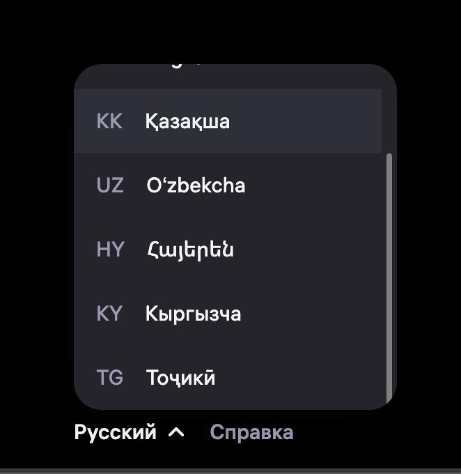
Geography: preparing for a global launch
Status: shipped and live in the app stores, updates roll out gradually; the numbers were measured before a major redesign.
At a glance
- Task: combine Telegram, VK and other social networks in one product that still feels coherent.
- What I did: co-led product design with the PM: scenarios, navigation, a design system from scratch, design-to-code reviews, some React components.
- Result: onboarding time −20%, lower sign-up drop-off, fewer design-to-code iterations.
Problem
Every screen felt like a different product. Features had no priorities, mobile was weak, there was no design system, and design and engineering worked apart. The risk cut both ways: copy existing apps and become another clone, or go “unique” and break basic patterns. No product combined all of this, so I analyzed Facebook, Snapchat, X, Telegram and VK and assembled the logic by hand.

Key decisions
Contested calls went into a decision log, backed by comparative analysis and regular reviews with the PM and engineering, so decisions stopped being a matter of taste.


Three layers instead of a feature list
I split the product into messaging, communities and content, each with one primary scenario. Anything that fit no layer left the first release. That is how “many features” stopped meaning “complex”.

Onboarding that explains the next step
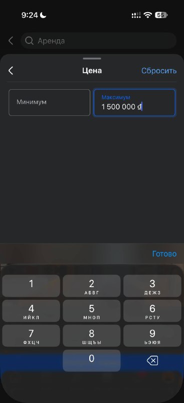
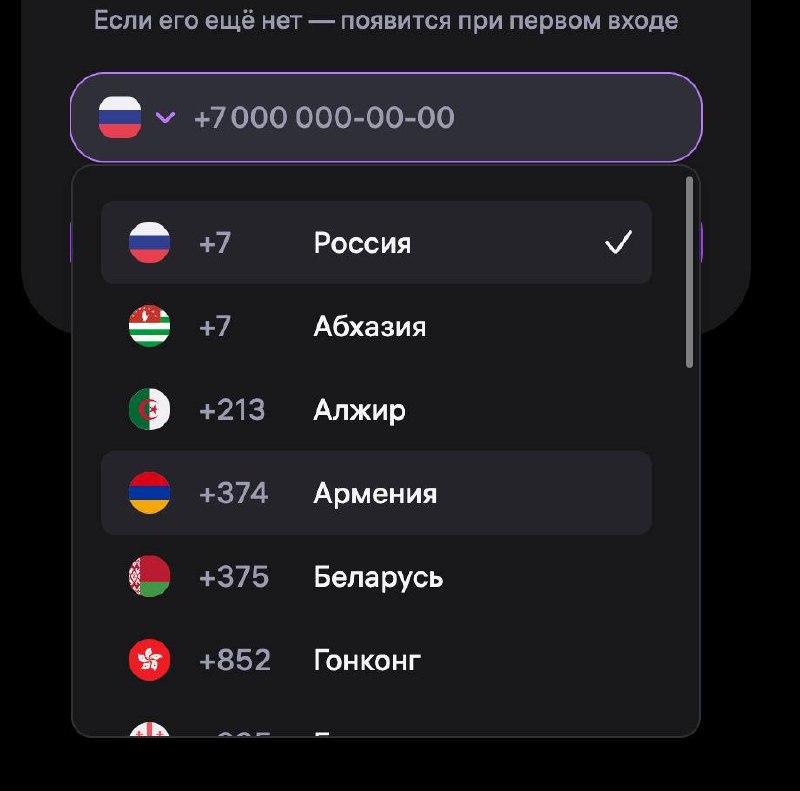
I simplified sign-up, added guidance, and made empty states explain what to do next instead of showing a blank screen.

One bottom bar for three layers
Contextual actions live inside the screen. Bars hide while reading, so the feed and chat get the whole screen.

One design system, reviewed in code
I built components for iOS, Android, Web and Tablet on shared tokens, with no private versions per designer. I introduced design-to-code reviews in Codex and built some React components myself, so engineering got behavior (states, animations, edge cases), not pictures.


Perceived responsiveness
Micro-interactions, Lottie hints, a mascot and considered loading states: the app responds even while the network is still thinking.

Familiar, but not a clone
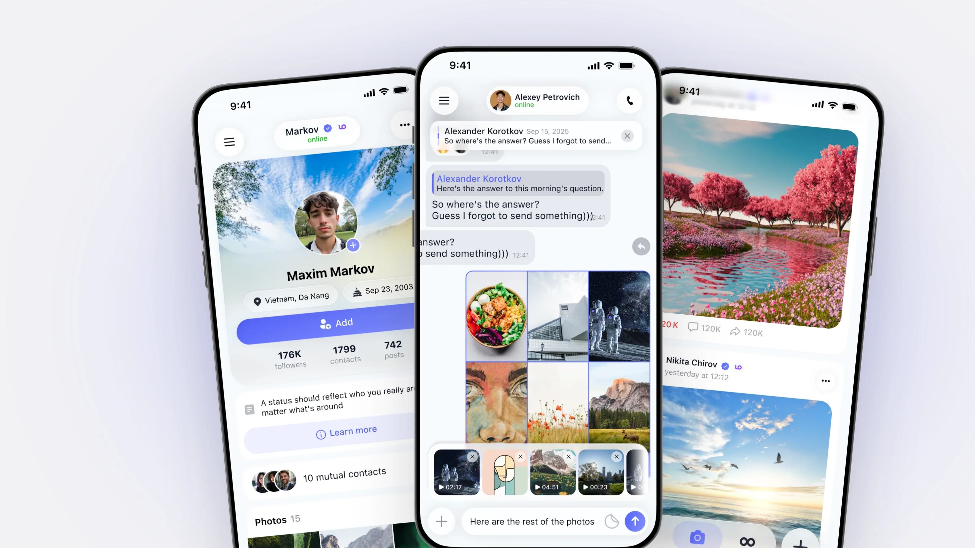
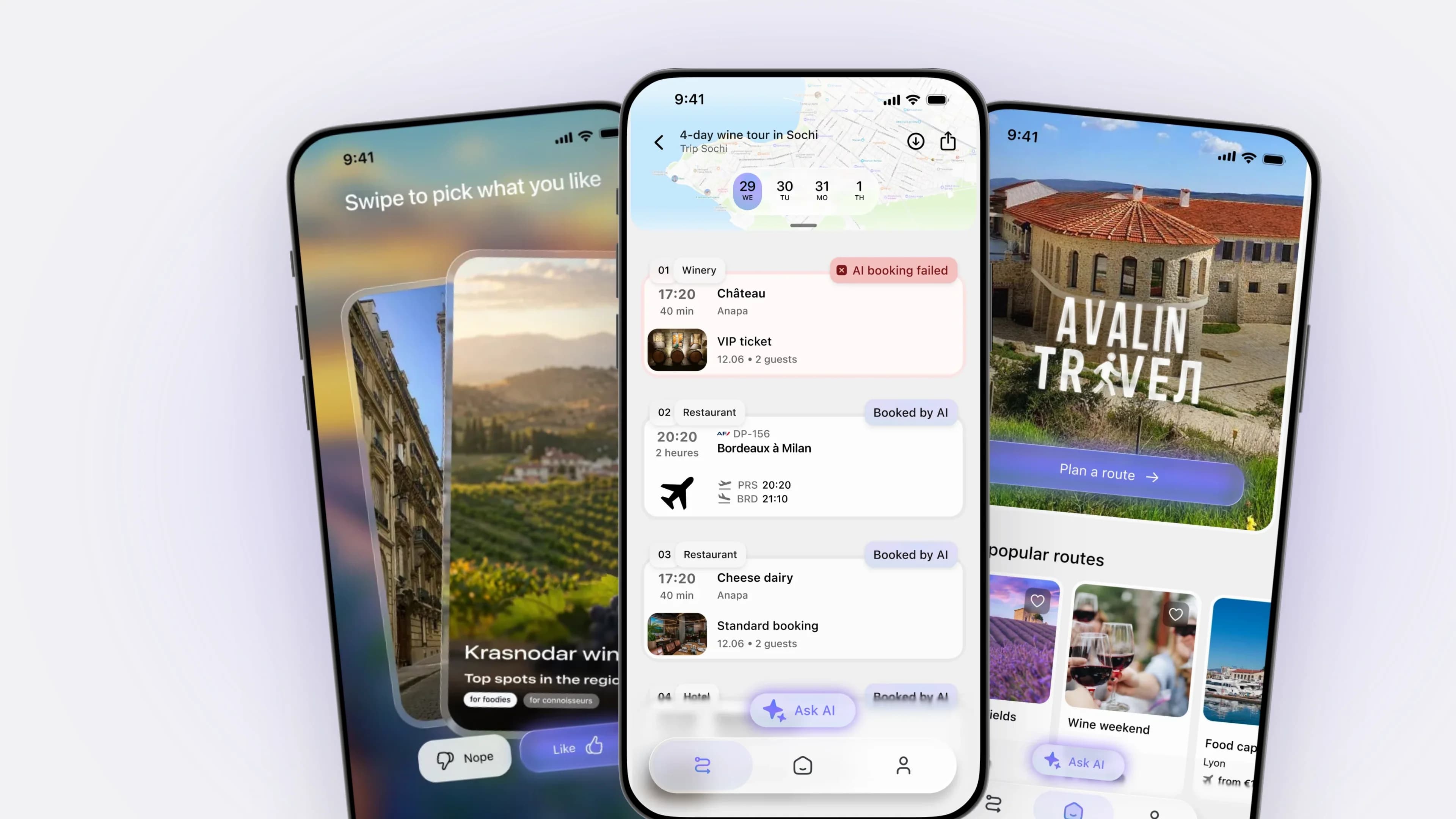
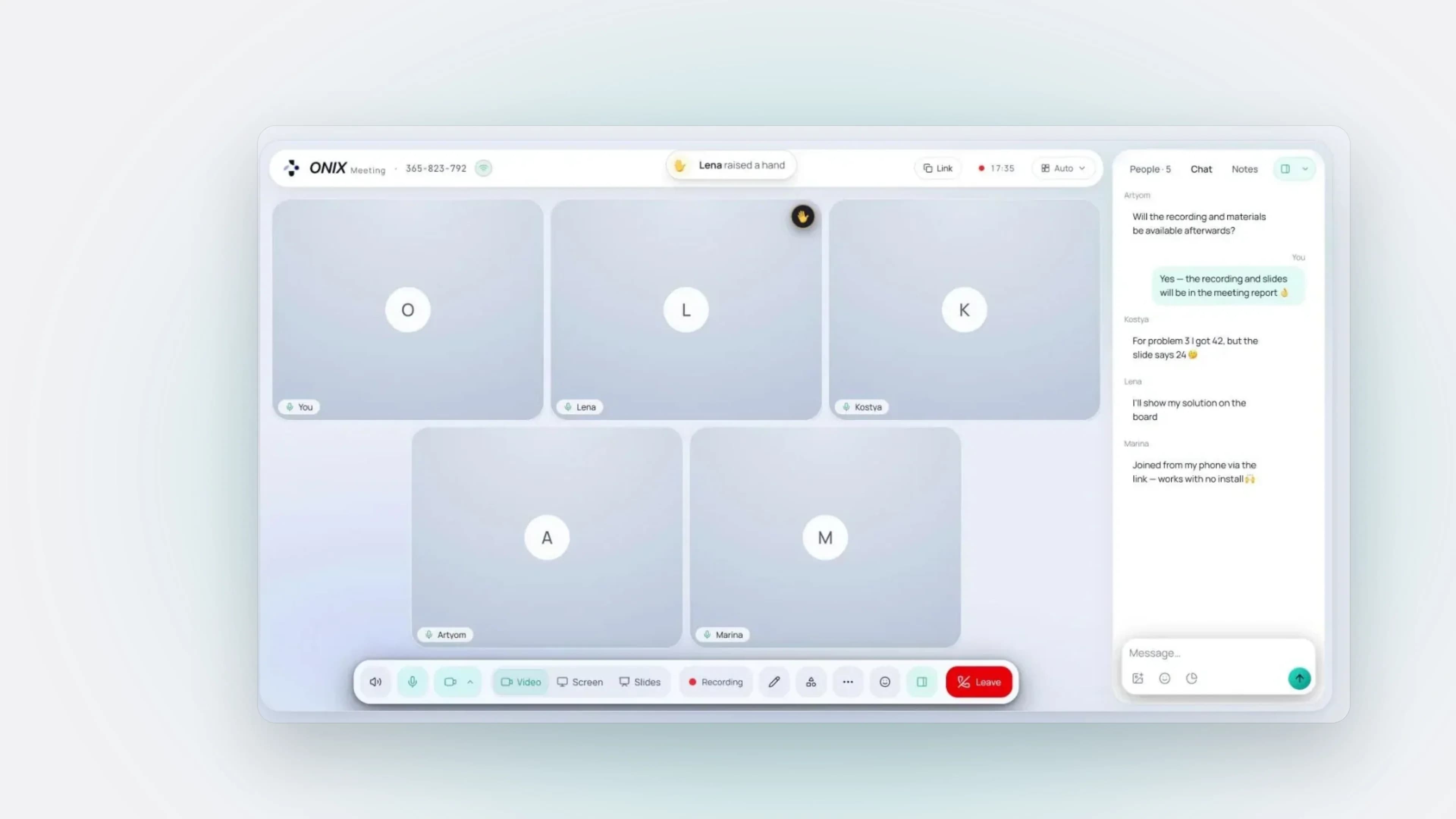
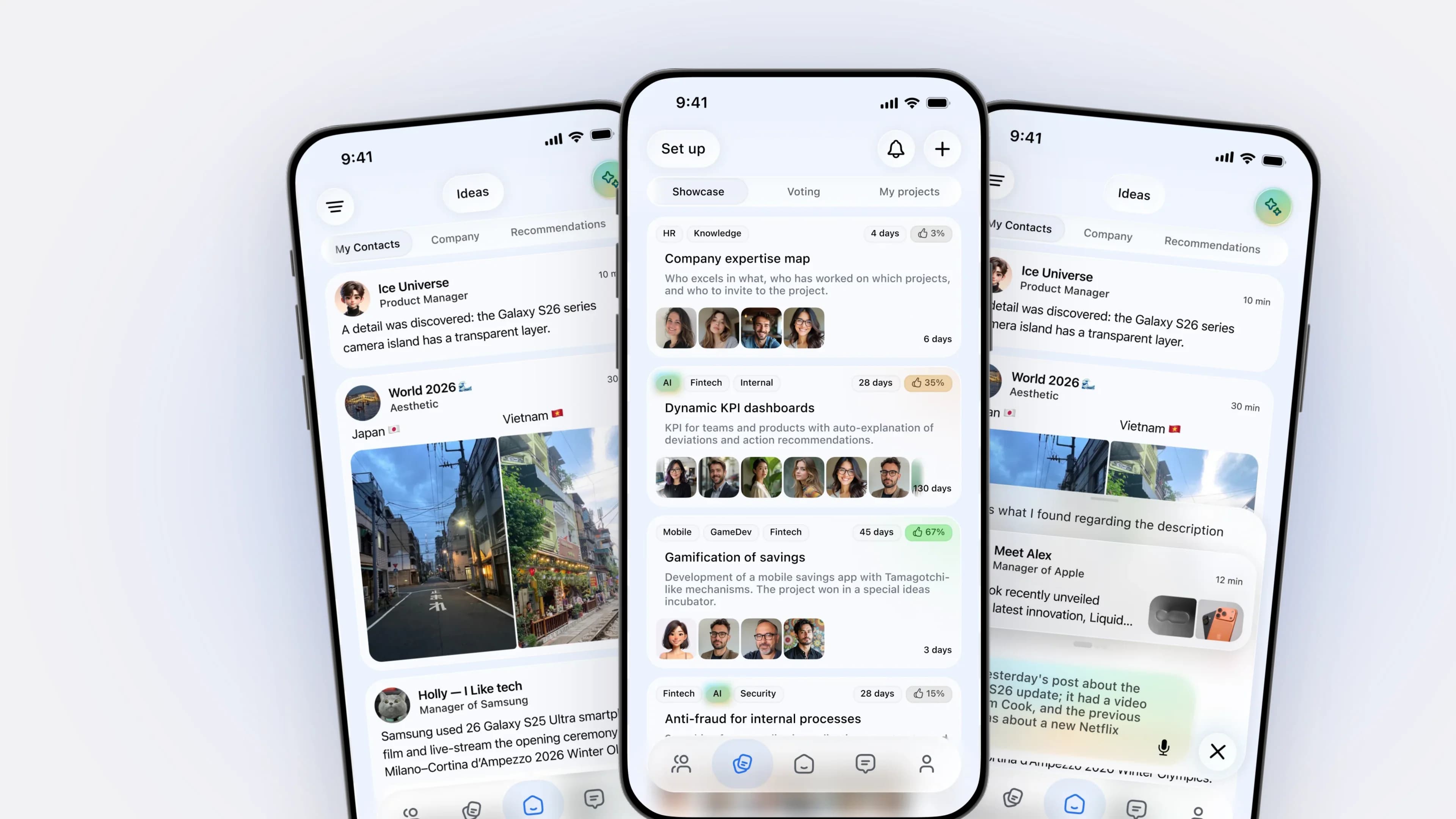
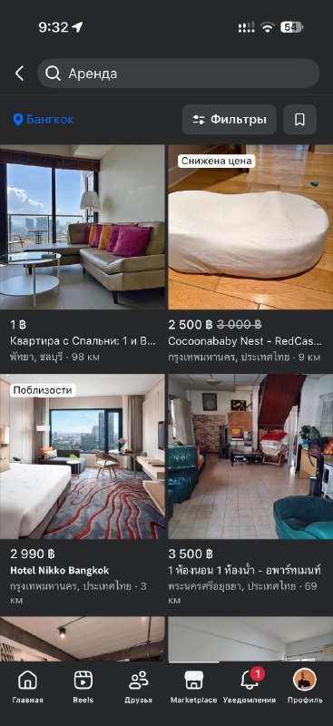
Chat forwarding with its own logic, files in chats shown as content rather than attachments, reworked communities, voice notes with transcripts, calls that open with an action. The product doesn’t look like a copy but stays intuitive.


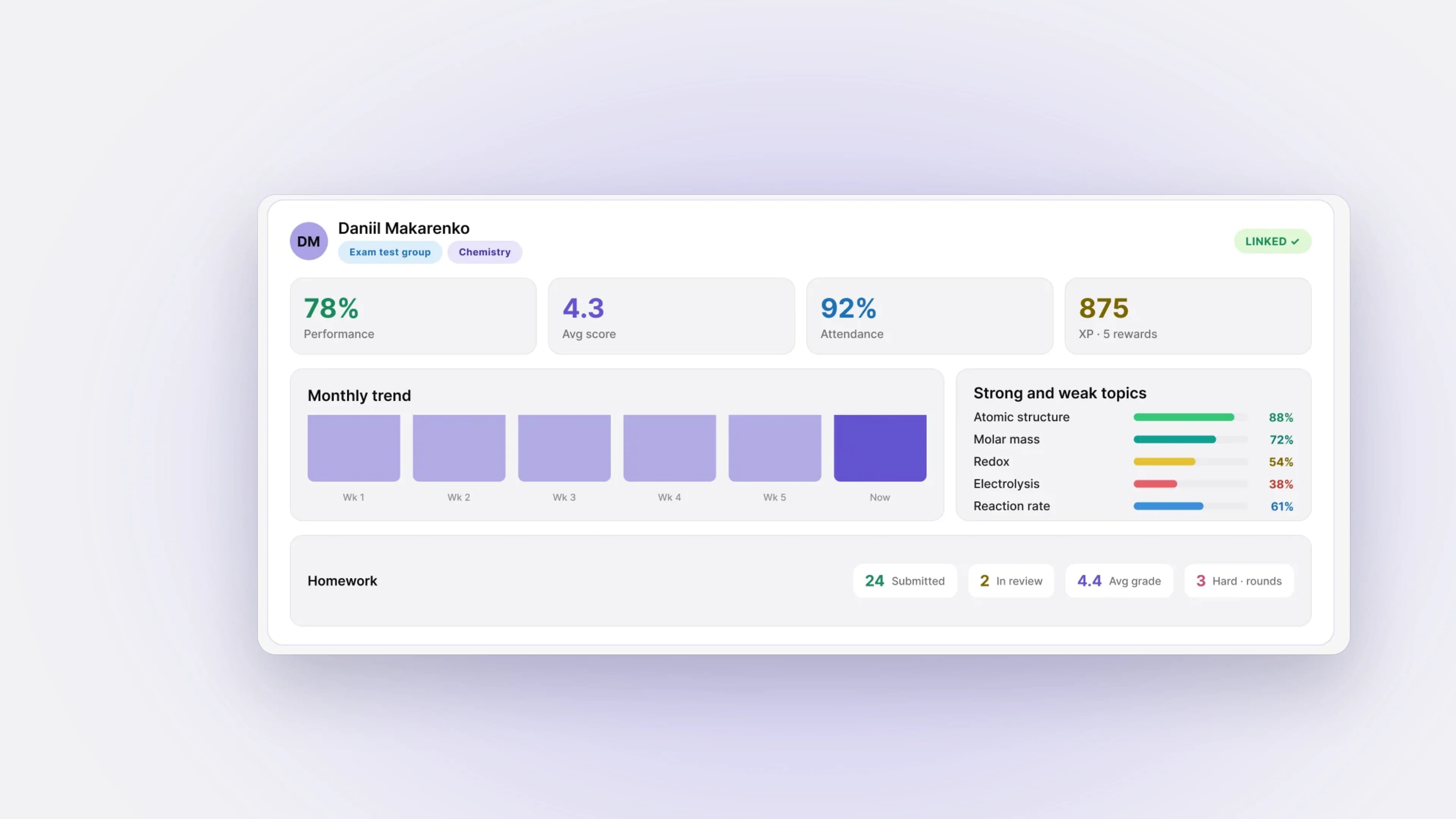
Store screenshots reuse the same components.

Outcome
Measured on pre-release builds. Hypothesis: with fewer steps, more people finish sign-up and stay in the app without stress. So we removed extra information from the screens and cut the data we ask for in the first pass.
- onboarding completion time: −20%
- drop-off at key sign-up and first-use steps: down
- length of the first session in the app: up
- design-to-code iterations: fewer after introducing design-to-code reviews
What's next
Launch hypotheses: higher retention, content engagement and chat usage.
B2C, Product, Messenger
LO — социальная платформа и мессенджер
Роль: Senior Product Designer (контракт, part-time ~2 ч/день) — вёл продуктовый дизайн вместе с PM
Срок: сентябрь 2025 — май 2026
Команда: 3 дизайнера, 3 разработчика, 1 продакт
Платформы: iOS, Android, Web, Tablet
География: готовится к глобальному запуску
Статус: приложение в сторах, обновления выкатываются постепенно; цифры сняты перед крупным редизайном.
Коротко
- Задача: объединить Telegram, VK и другие соцсети в одном цельном продукте.
- Что сделал я: вёл продуктовый дизайн вместе с PM: сценарии, навигация, дизайн-система с нуля, design-to-code ревью, часть React-компонентов.
- Результат: время онбординга −20%, ниже drop-off при регистрации, меньше итераций между дизайном и кодом.
Проблема
Каждый экран был как будто из другого продукта. Функции без приоритетов, слабая мобильная версия, нет дизайн-системы, дизайн и разработка живут отдельно. Риск с двух сторон: скопировать чужие решения и стать ещё одним клоном или сделать «уникально» и сломать базовые паттерны. Готового продукта с такой комбинацией нет, поэтому я разбирал Facebook, Snapchat, X, Telegram и VK и собирал логику вручную.

Ключевые решения
Спорные решения шли в decision log со сравнительным анализом и регулярными ревью с PM и разработкой — так они переставали быть вкусовыми.


Три слоя вместо списка функций
Разложил продукт на общение, сообщества и контент, у каждого слоя — главный сценарий. Всё, что не попало ни в один слой, ушло из первого релиза. Так «много функций» перестало означать «сложно».

Онбординг, который объясняет следующий шаг
Упростил регистрацию, добавил подсказки, а empty states теперь объясняют, что делать дальше, а не показывают пустой экран.

Один нижний бар на три слоя
Контекстные действия — внутри экрана. Бары скрываются при чтении, чтобы отдать всё место ленте и чату.

Одна дизайн-система, проверенная в коде
Собрал компоненты для iOS, Android, Web и Tablet на общих токенах, без «своих» версий у дизайнеров. Ввёл design-to-code ревью (Codex), часть React-компонентов собрал сам: разработка получала поведение (состояния, анимации, edge cases), а не картинку.


Ощущение отклика
Микроанимации, Lottie-подсказки, маскот и состояния загрузки: приложение отвечает сразу, даже когда сеть ещё думает.

Понятно, но не копия
Пересылка чатов со своей логикой, файлы в чатах как контент, а не вложения, переработанные сообщества, голосовые с расшифровкой, звонки, которые начинаются с действия. Продукт не выглядит копией и остаётся понятным.


Скриншоты для магазина собраны на тех же компонентах.

Результат
Замеры на предрелизных сборках. Гипотеза: если сократить шаги, больше людей дойдут до конца регистрации и останутся в приложении без стресса. Для этого убрали лишнюю информацию с экранов и сократили данные, которые просим в первом проходе.
- время прохождения онбординга: −20%
- drop-off на ключевых шагах регистрации и первого использования: снизился
- длительность первого захода в приложение: выросла
- итерации между дизайном и кодом: меньше после ввода design-to-code ревью
Что дальше
Гипотезы на запуск: рост retention, вовлечённости в контент и использования чатов.