Daniil MakarenkoLet's talk
WorkCVContact

Work by direction

Product & SaaSEdTechBrand & Identity

Daniil Makarenko — Senior Product Designer / Case study

Dalee Architecture Bureau — brand and a website that sells

Year
2024
Role
Lead UX/UI Designer (full-time)
Client
Dalee Architecture Bureau
Industry
Education
Team
4 specialists: UX/UI, Webflow, visual communications, contractors
Duration
Nov 2023 — Sep 2024

Role: Lead UX/UI Designer
Team: 4 specialists — UX/UI, Webflow, visual communications, contractors
Timeline: November 2023 — September 2024
Status: Brand and website launched in 2024; metrics from the first year.

At a glance

  • Challenge: build an architecture bureau’s brand and website from scratch so they help sell projects.
  • What I did: positioning, identity and brand book, website design, an interactive tender portfolio.
  • Result: website conversion to inquiries 1.4% → 2.1%; tender materials from 5 days to 2; design approvals from 12 to 8 working days.

Problem

Dalee had a strong philosophy and a clear architectural language, but no coherent brand. Visuals didn’t reflect its approach, and the website was a pile of projects, not a sales tool. The brand had to stand out among studios and work both digitally and offline.

Usability audit of the old site: problems marked on every page

Key decisions

Meaning before visuals

I researched the market and competitors, studied how the bureau makes decisions, and shaped the positioning and brand manifesto. Takeaway: the brand had to be architectural in its logic, not decorative.

Identity as a system, not a logo

Logo, typography, rules for composition and space, brand book, and guidelines. The minimal visual language mirrors the bureau’s architecture.

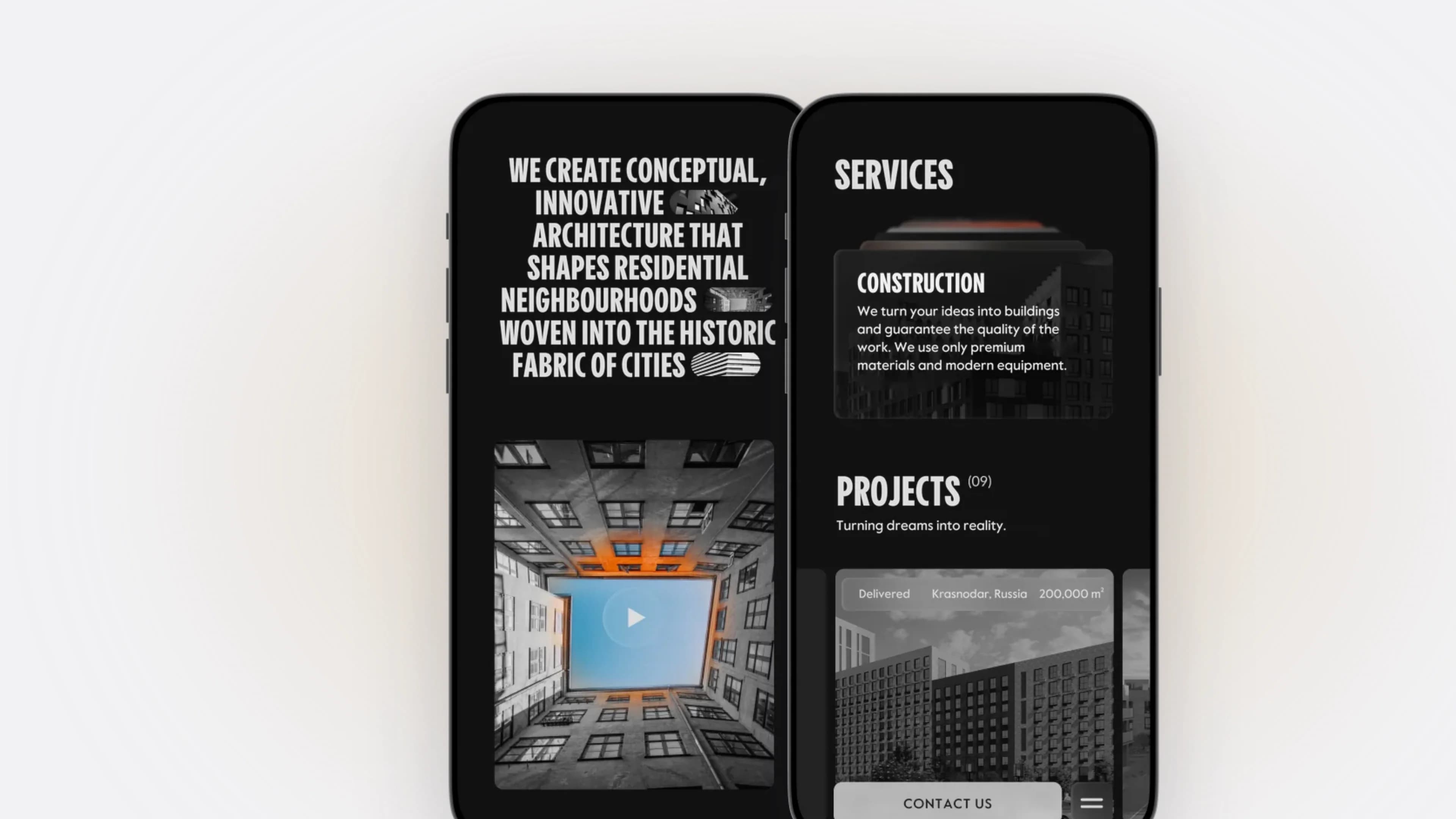
New site home: bureau manifesto and 30+ completed projects New site: projects, documentation, services and contact form

A website that tells how the bureau thinks, not a portfolio

I made the prototypes and final design for image-heavy content: large images, white space, micro-animations. After a usability review of the old site, I reworked the path from project to inquiry: fewer steps, clearer calls to action, contact on every page.

An interactive portfolio for tenders

A project selection for a tender is assembled from ready-made blocks instead of laid out from scratch.

The brand beyond the screen

Merch and templates for presentations, envelopes, and architectural documentation.

Outcome

  • Corporate website conversion to inquiries: from 1.4% to 2.1%, with inquiries collected on the site and in a CRM instead of Excel and Google Forms
  • Tender and presentation material prep: from 5 days to 2, with the website and an interactive portfolio replacing dozens of PDFs
  • Design approval cycle: from 12 to 8 working days, after introducing regular design reviews and unified presentation standards
  • 5+ major digital projects delivered with developers and construction companies within the year

Results

  • +17% activation
  • +11% week-2 retention
  • -19% support tickets on onboarding

Branding, Web, B2B · Tools: Figma, Amplitude, Miro

АБ «Далее» — бренд и сайт как инструмент продаж

Роль: Lead UX/UI Designer
Команда: 4 специалиста — UX/UI, Webflow, визуальные коммуникации, подрядчики
Срок: ноябрь 2023 — сентябрь 2024
Статус: Бренд и сайт запущены в 2024, метрики за первый год.

Коротко

  • Задача: собрать с нуля бренд и сайт архитектурного бюро, которые помогают продавать проекты.
  • Что сделал я: позиционирование, айдентика и брендбук, дизайн сайта, интерактивное портфолио для тендеров.
  • Результат: конверсия сайта в заявку 1,4% → 2,1%; материалы к тендерам — с 5 дней до 2; согласование дизайна — с 12 до 8 рабочих дней.

Проблема

У «Далее» сильная философия и чёткий архитектурный язык, но не было цельного бренда. Визуал не отражал глубину подхода, а сайт был набором кейсов, а не инструментом продаж. Бренду нужно было выделиться среди студий и работать и в digital, и офлайн.

Аудит старого сайта: проблемы отмечены на каждой странице

Ключевые решения

Сначала смысл, потом визуал

Я исследовал рынок и конкурентов, разобрал, как бюро принимает решения, и сформировал позиционирование и бренд-манифест. Вывод: бренд должен быть не декоративным, а архитектурным по логике.

Главная нового сайта: манифест бюро и 30+ реализованных проектов

Айдентика как система, а не логотип

Логотип, типографика, правила композиции и работы с пространством, брендбук и гайдлайны. Минималистичный язык повторяет характер архитектуры бюро.

Новый сайт: проекты, документация, услуги и форма связи

Сайт как рассказ о мышлении бюро, а не портфолио

Я сделал прототипы и финальный дизайн под тяжёлый визуальный контент: крупные изображения, много воздуха, микроанимации. После юзабилити-ревью старого сайта переработал путь от проекта к заявке: меньше шагов, понятнее призывы, контакт на любой странице.

Интерактивное портфолио для тендеров

Подборка проектов под тендер собирается из готовых блоков, а не верстается заново.

Бренд за пределами экрана

Мерч и шаблоны презентаций, конвертов и архитектурной документации.

Результат

  • Конверсия корпоративного сайта в заявку: с 1,4% до 2,1% — заявки собираются на сайте и в CRM вместо Excel и Google Forms
  • Подготовка материалов к тендерам и презентациям: с 5 дней до 2 — сайт и интерактивное портфолио вместо десятков PDF
  • Цикл согласования дизайна: с 12 до 8 рабочих дней — регулярные дизайн-ревью и единые стандарты подачи
  • За год реализовано 5+ крупных digital-проектов с застройщиками и девелоперами

All case studies · CV

Senior Product Designer

I design 0→1 platforms and design systems — from research to production code

Проектирую 0→1 платформы и дизайн-системы — от исследования до продакшн-кода

7+ years: Smart City and PropTech, messaging, EdTech, and B2B platforms.

7+ лет: Smart City и PropTech, мессенджеры, EdTech и B2B-платформы.
Product / UI/UXDesign systemsDesign-to-code0→1 productsTouch, 3D, mobile
Product / UI/UXДизайн-системыDesign-to-code0→1 продуктыТач, 3D, мобайл
TelegramEmailFacebook
View casesCV

Daniil Makarenko

Industries

PropTechSmart CityMessagingEdTechTravelAI productsB2B SaaSInternal platforms

Design

UI systems • Interaction design • Visual hierarchy

Product

Discovery • JTBD • Hypotheses

Systems

Design tokens • Component libraries • Scalable patterns

Tools

Figma • MCP workflows • Cursor

Daniil Makarenko
Daniil Makarenko

About me

Senior Product Designer with 7+ years of experience in complex B2B and B2C products for web, mobile, and unconventional surfaces — touch tables, 3D environments, and kiosks. I lead products from research and 0→1 concept through launch: UX architecture, design systems, AI features, and design-to-code — building production-ready React components myself with AI agents.

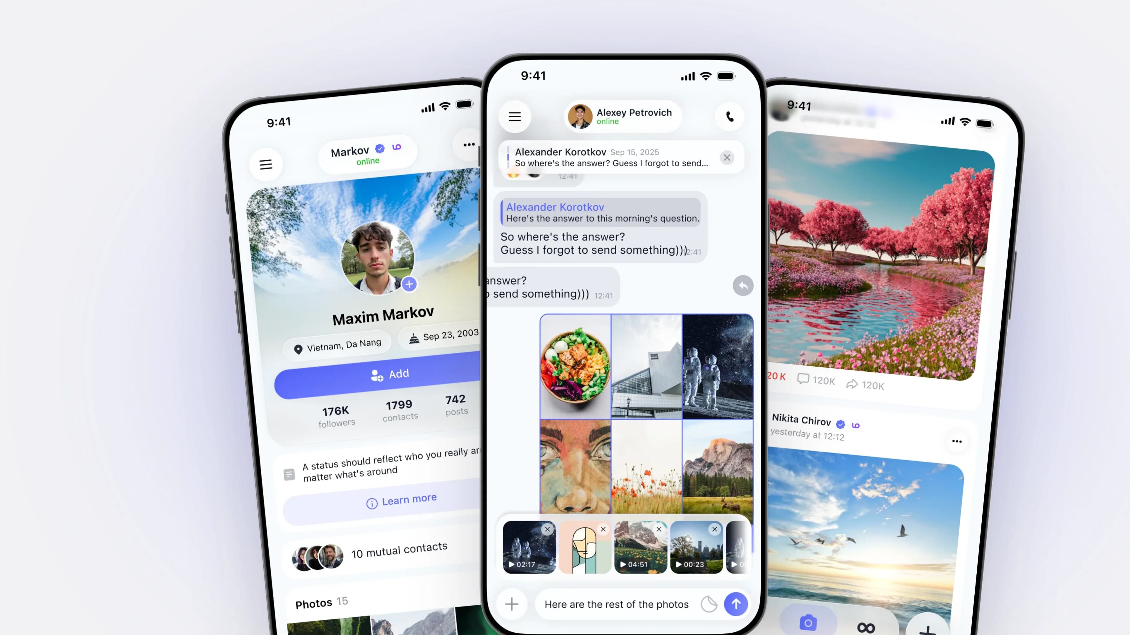
Recent projects: AVA Group / Avalin — interactive 3D platforms for real estate and Smart City, including partner pilots with RZD and Aeroflot; LO (Dubai) — a messaging and social platform for iOS, Android, and web; Picaton — a networking platform with AI recommendations. Previously — Affix Group, AYAX, AB Dalee, and Level Group.

Led a team of 8 designers and 20+ regional specialists, conducting UX audits, design reviews, and mentoring. I validate decisions through interviews, usability testing, and product analytics.

Key results: the share of employees using internal systems daily increased from 8% to 23%, and weekly usage from 14% to 31%; account manager inquiries decreased by 34% through a self-service portal; a new feature shipped in 4 weeks instead of 6; onboarding completion became 20% faster based on measurements taken before a major redesign.

View cases

Work examples

Selected product and interface work with measurable outcomes.

Feed

Feed

Home

Home

Wine Card

Wine Card

Slider

Slider

Home

Home

Giveaway

Giveaway

Projects

Projects

Calendar

Calendar

Profile

Profile

Mini App

Mini App

Analytics

Analytics

Chat

Chat

Study

Study

Market

Market

AI Chat

AI Chat

Picker

Picker

Attachments

Attachments

Feed

Feed

Places

Places

Changer

Changer

Profile

Profile

Profile

Profile

Mini-app

Mini-app

Wine Scanner

Wine Scanner

Filter

Filter

Home

Home

Brief

Brief

Settings

Settings

Home

Home

Quiz

Quiz

AI Ideas

AI Ideas

AI Booking

AI Booking

Calendar

Calendar

Website

Website

3D Tour

3D Tour

Control Center

Control Center

Wishlist

Wishlist

Share

Share

Shopping Cart

Shopping Cart

Settings

Settings

Profile

Profile

Library

Library

Apartment Card

Apartment Card

Website

Website

Website

Website

Trip Map

Trip Map

Booking

Booking

Profile

Profile

Favorites

Favorites

Builder

Builder

Transport Selector

Transport Selector

Product Grid

Product Grid

Filter

Filter

Home

Home

Feed

Feed

Home

Home

Wine Card

Wine Card

Slider

Slider

Home

Home

Giveaway

Giveaway

Projects

Projects

Calendar

Calendar

Profile

Profile

Mini App

Mini App

Analytics

Analytics

Chat

Chat

Study

Study

Market

Market

AI Chat

AI Chat

Picker

Picker

Attachments

Attachments

Feed

Feed

Places

Places

Changer

Changer

Profile

Profile

Profile

Profile

Mini-app

Mini-app

Wine Scanner

Wine Scanner

Filter

Filter

Home

Home

Brief

Brief

Settings

Settings

Home

Home

Quiz

Quiz

AI Ideas

AI Ideas

AI Booking

AI Booking

Calendar

Calendar

Website

Website

3D Tour

3D Tour

Control Center

Control Center

Wishlist

Wishlist

Share

Share

Shopping Cart

Shopping Cart

Settings

Settings

Profile

Profile

Library

Library

Apartment Card

Apartment Card

Website

Website

Website

Website

Trip Map

Trip Map

Booking

Booking

Profile

Profile

Favorites

Favorites

Builder

Builder

Transport Selector

Transport Selector

Product Grid

Product Grid

Filter

Filter

Home

Home

Try switching the theme —
the interfaces change with it.

Cases

Detailed case studies across product and interface challenges.

Product & SaaS

Own products and tools, from zero to first users.7 cases · 2021–2026

Messaging · iOS, Android, Web
−20%onboarding time

LO — social platform and messenger

Role: Senior Product Designer (contract, part-time ~2 h/day) — led product design together with the PM Timeline: September 2025 — May 2026 Team: 3 designers, 3 developers, 1 product manager Platforms: iOS, Android, Web, Tablet Geography: preparing for a global launch Status: shipped and live in the app stores, updates roll out gradually; the numbers were measured before a major redesign. At a glance Task: combine Telegram, VK and other social networks in one product that still feels coherent. What I did: co-led product design with the PM: scenarios, navigation, a design system from scratch, design-to-code reviews, some React components. Result: onboarding time −20%, lower sign-up drop-off, fewer design-to-code iterations. Problem Every screen felt like a different product. Features had no priorities, mobile was weak, there was no design system, and design and engineering worked apart. The risk cut both ways: copy existing apps and become another clone, or go “unique” and break basic patterns. No product combined all of this, so I analyzed Facebook, Snapchat, X, Telegram and VK and assembled the logic by hand. Key decisions Contested calls went into a decision log, backed by comparative analysis and regular reviews with the PM and engineering, so decisions stopped being a matter of taste. Three layers instead of a feature list I split the product into messaging, communities and content, each with one primary scenario. Anything that fit no layer left the first release. That is how “many features” stopped meaning “complex”. Onboarding that explains the next step I simplified sign-up, added guidance, and made empty states explain what to do next instead of showing a blank screen. One bottom bar for three layers Contextual actions live inside the screen. Bars hide while reading, so the feed and chat get the whole screen. One design system, reviewed in code I built components for iOS, Android, Web and Tablet on shared tokens, with no private versions per designer. I introduced design-to-code reviews in Codex and built some React components myself, so engineering got behavior (states, animations, edge cases), not pictures. Perceived responsiveness Micro-interactions, Lottie hints, a mascot and considered loading states: the app responds even while the network is still thinking. Familiar, but not a clone Chat forwarding with its own logic, files in chats shown as content rather than attachments, reworked communities, voice notes with transcripts, calls that open with an action. The product doesn’t look like a copy but stays intuitive. Store screenshots reuse the same components. Outcome Measured on pre-release builds. Hypothesis: with fewer steps, more people finish sign-up and stay in the app without stress. So we removed extra information from the screens and cut the data we ask for in the first pass. onboarding completion time: −20% drop-off at key sign-up and first-use steps: down length of the first session in the app: up design-to-code iterations: fewer after introducing design-to-code reviews What's next Launch hypotheses: higher retention, content engagement and chat usage.

Messaging · iOS, Android, Web
−20%
onboarding time

LO — social platform and messenger

Role: Senior Product Designer (contract, part-time ~2 h/day) — led product design together with the PM
Timeline: September 2025 — May 2026
Team: 3 designers, 3 developers, 1 product manager
Platforms: iOS, Android, Web, Tablet
Geography: preparing for a global launch
Status: shipped and live in the app stores, updates roll out gradually; the numbers were measured before a major redesign.

At a glance

  • Task: combine Telegram, VK and other social networks in one product that still feels coherent.
  • What I did: co-led product design with the PM: scenarios, navigation…
B2CProductMessenger
PropTech · internal products
8% → 23%internal-system DAU

AYAX — transforming design across product and team

Role: Lead UX/UI Designer — led design for internal products and the design team Period: March 2018 — August 2021 (3.5 years) Team: 8 designers at HQ and 20+ regional specialists Context: a real estate network of 20+ offices, the largest tech-driven real estate service in Southern Russia Status: Shipped and in production; metrics measured in Mixpanel, 2018–2021. At a glance Challenge: the business was growing, but fragmented design and hard-to-use internal systems held it back. What I did: built the design function from scratch, led a distributed team, introduced a design system, launched the “My AYAX” learning app, and tied design to metrics. Result: internal-system DAU 8% → 23%, learning engagement 12% → 29%; new-hire onboarding cut from 6 to 4 weeks. Problem Offices built interfaces on their own, with no design system. CRM, HR, and learning tools were complex and underused. Designers acted as executors, not product partners. The network of 20+ offices was growing, and unsystematic design was slowing it down. Key decisions A design department, not a pool of executors I introduced design reviews, syncs, strategy sessions, mentoring and growth tracks, internships, and trial days. The team started influencing product decisions instead of just producing screens. Internal tools that drive the business come first We redesigned the agents’ CRM: simpler workflows, fewer steps, a predictable interface. Websites and platforms across business areas moved to one UX standard. Learning: from an events calendar to a career track Learning was an obligation: an events calendar and manual communication, no shared knowledge base, no sense of progress, no career logic. I started with research: 40 interviews with agents, mentors, HR, and managers; a pain map in Notion and Miro; a prototype test with 20 users (FigJam + Useberry). Each pain became a mechanic in the “My AYAX” app. Lessons earn resources to build a “dream home,” so progress is visible. Levels, courses, tasks, and achievements show where to grow. Learning is tests, cases, and interactive tasks rather than reading. A leaderboard and a “dream office” give managers a tool, and guides and growth plans live in one knowledge base. One design system for products and marketing Every product looked different. I rolled out a global design system, aligned products with marketing, and documented rules so the team could scale. Development got faster. Data over taste We implemented Mixpanel and tracked DAU, WAU, and retention to compare flows before and after the redesign. Outcome DAU (share of employees using internal systems): 8% → 23% WAU: 14% → 31% Retention: D1 — 38%, D7 — 21%, D30 — 11% learning-app engagement (>1 lesson per week): 12% → 29% ; time in the app: +34% ; completed courses: +70% new-hire onboarding: from 6 to 4 weeks design delivery speed: about +20% one design system and brand book across all 20+ offices; new offices’ websites and social media launched turnkey How it was measured: Mixpanel, before vs. after the redesign of key flows and onboarding; users were sales teams and internal staff. The learning track made it easier for HR to guide new hires and measure their KPIs.

PropTech · internal products
8% → 23%
internal-system DAU

AYAX — transforming design across product and team

Role: Lead UX/UI Designer — led design for internal products and the design team
Period: March 2018 — August 2021 (3.5 years)
Team: 8 designers at HQ and 20+ regional specialists
Context: a real estate network of 20+ offices, the largest tech-driven real estate service in Southern Russia
Status: Shipped and in production; metrics measured in Mixpanel, 2018–2021.

At a glance

  • Challenge: the business was growing, but fragmented design and hard-to-use internal systems held it back.
  • What I did: built the design function from scratch, led a distributed team, introd…
B2BDashboardDesignSystem
PropTech · touch tables, web, mobile
9 → 5steps to a shortlist

Avalin — Interactive 3D Products for Real Estate and Governments

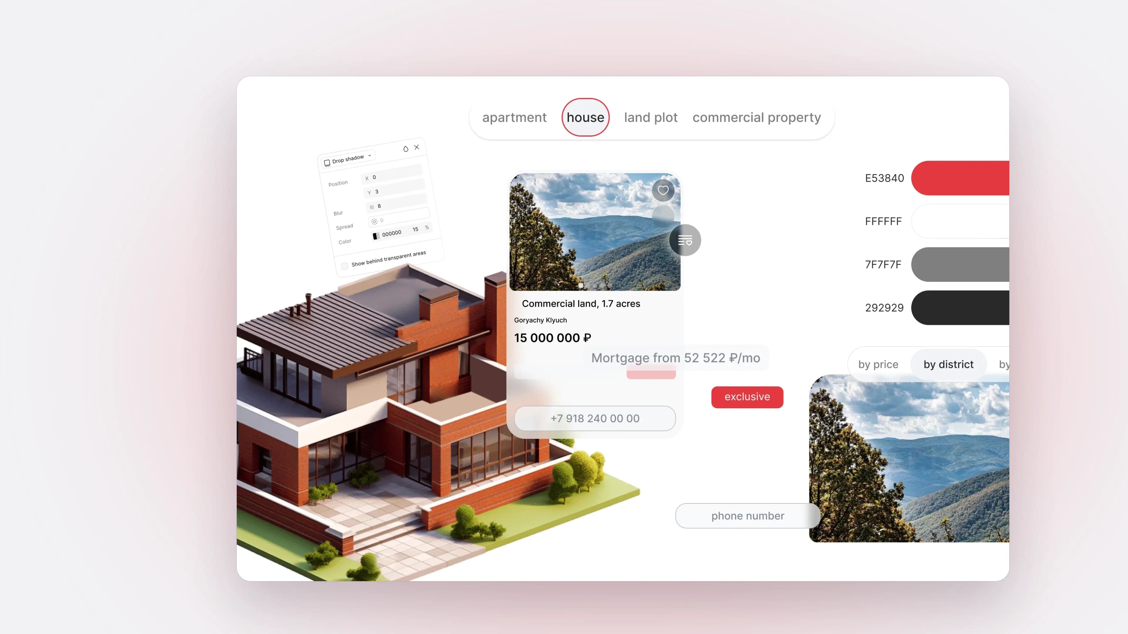
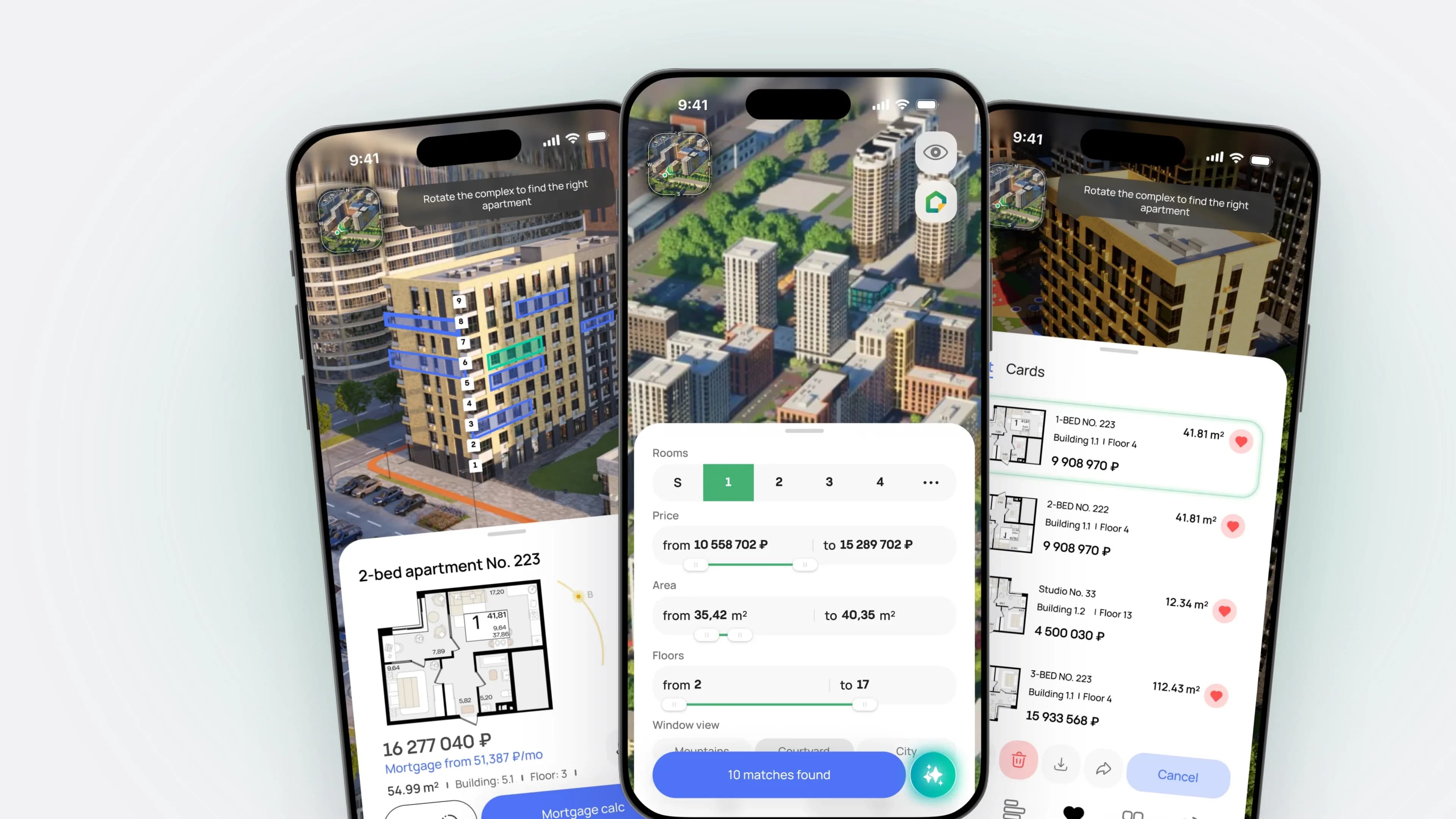
Type: a product ecosystem of interactive 3D presentations of real estate and territories — touch tables in showrooms, web platforms for developers’ websites, mobile versions, digital twins of cities. Role: Senior Product Designer / product consultant — UX architecture, design system, screen design, handoff to development, and design reviews. Team: Avalin (AVA Group) product team — design, 3D visualization, Unreal/Web development, sales. Timeline: September 2025 — present. Platforms: 1920×1080 and 4K (4096×2160) touch tables, web desktop, mobile 440×956, 360° tours. Project geography: Russia, Georgia, UAE, Qatar, Bahrain, China, USA, Turkey, France. Status: shipped and in use by clients — showroom touch tables, web platforms and mobile versions. Company scale: 60+ projects, 8+ years in the market, 4 countries, 80+ employees. At a glance Challenge: developers sell unbuilt homes with PDFs and renders, and each project’s interface was rebuilt from scratch. My role: UX architecture, design system, screens, handoff and design reviews for products with an interface over a 3D scene. Outcome: journey to a shortlist cut from 9 steps to 5, user errors −27%, average order value +18%, sales +13% in pilots. Products are live with clients. Problem Sales offices showed foam models and printouts; on the website it took five steps to see the view from a 15th-floor window. Every new complex was designed from scratch. And each market needs different entities: construction phases, cadastre, resort infrastructure. The goal was a system that lets the team launch a project for a new market in weeks, not months. Key decisions One master UI kit instead of a new interface per project I pulled what dozens of projects shared into a master kit: light and dark navbars, scene controls, an apartment card, filters with a live counter, 200+ infrastructure icons. Every project, from Batumi to the 2030 Games, is built from these components, recolored per brand. A Figma → Unreal Engine pipeline with visual QA keeps the UI intact in the engine. Touch tables that sell a scenario, with a layer for investors At the Atlantis resort, the interface sells a vacation, not square meters: infrastructure markers, walking-time radii, a jump into a 360 tour, and weather that changes the scene. In Batumi, buyers are more often investors, so facade-based selection got a second layer: stats for selected units and a commission calculator. One screen serves both the buyer and the broker. A digital twin for the 2030 Games, localized from day one The hardest project was a whole territory in the French Alps. Four regions switch like floors; a 2025 → 2030 timeline shows construction by year, so the interface tracks readiness instead of selling. It was designed directly in French. Localization (Russian, English, French, Georgian, Arabic markets) is part of the design everywhere: line length and element order are planned up front. 3D in the browser, with an AI assistant on the scene The Patriki web platform runs on the developer’s site with no install. The apartment card stays on top of the 360 tour, so buyers can reserve without leaving it; a 440×956 mobile version keeps the same flows. Filters serve people who know what they want; others type or say “a two-bedroom on the 15th floor with a mountain view.” The assistant returns apartment cards on the 3D scene , not a list, so dialogue and 3D share one screen. Klonar takes this outside real estate: an avatar consultant for pharmacies and clinics that replies in the visitor’s language. The core work is defining what it may and may not say about medicine. New markets change the data model, not the components Projects in Abu Dhabi, Bahrain, Qatar and Amman break the “building → floor → apartment” scheme: property passports, cadastre and land use, role-based entry with its own first screen. The entities changed; the components didn’t. For approvals and planning, the same scene gets layers for transport, utilities, natural risks and heritage: one city with toggles, not a map per agency. As a control room, every layer follows one scheme (category → indicators → objects), with the same panel, compass and timeline as in sales, so operators don’t learn a second interface. Outcome Customer journey to a property shortlist: from 9 steps to 5 User errors: −27% , via simplified flows and predictable states Sales: +13% ; average order value: +18% , via interactive presentation and personalized showcases One master kit serves touch tables, web and mobile across all markets How it was measured: the first month of pilot launches at 4 client companies, with their buyers and sales managers. What’s next Klonar beyond real estate: pharmacies, clinics and factory access points.

PropTech · touch tables, web, mobile
9 → 5
steps to a shortlist

Avalin — Interactive 3D Products for Real Estate and Governments

Type: a product ecosystem of interactive 3D presentations of real estate and territories — touch tables in showrooms, web platforms for developers’ websites, mobile versions, digital twins of cities.

Role: Senior Product Designer / product consultant — UX architecture, design system, screen design, handoff to development, and design reviews.

Team: Avalin (AVA Group) product team — design, 3D visualization, Unreal/Web development, sales.

Timeline: September 2025 — present.

Platforms: 1920×1080 and 4K (4096×2160) touch tables, web desktop, mobile 440×956, 360°…

PropTechSmartCity3DDesignSystemAIB2B
B2B · client portal
−34%repeat requests to managers

Affix Group Corporate Portal

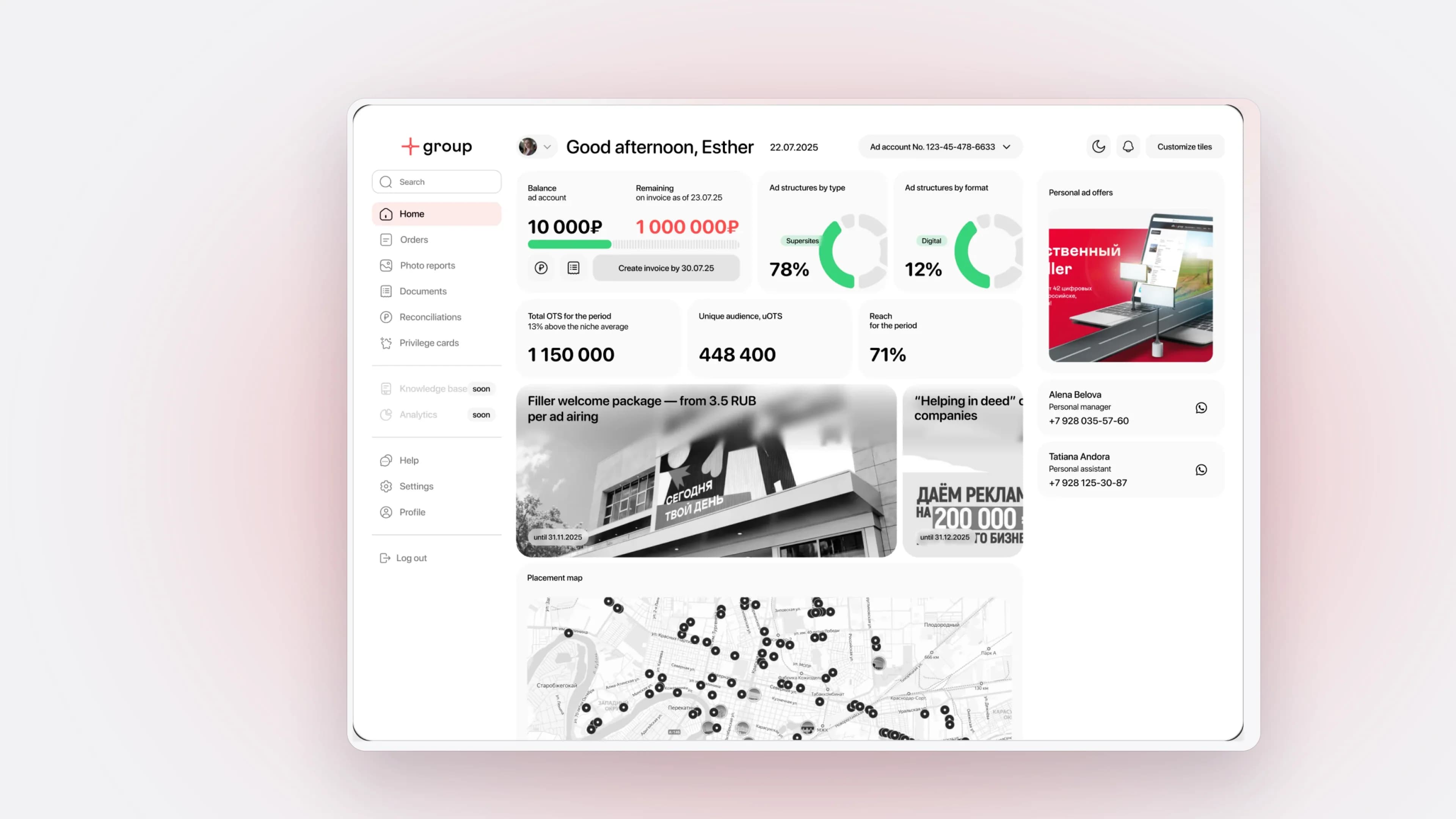
Type: Client portal + analytics platform Status: Shipped and in use; metrics from 2025. Role: Senior UX/UI Designer — the only designer: audit, research, UX architecture, UI kit, validation with clients. Team: two team leads, engineering, a focus group of 6 clients. Timeline: Oct 2024 — Sep 2025. At a glance Task: clients relied on managers for every export and report, overloading them and eroding trust. What I did: sole designer: research, portal UX, UI kit, client validation. Result: −34% repeat requests, +19% return rate, NPS +11, features in 4 weeks instead of 6. Problem Everything ran on photo reports and spreadsheets, with no transparent campaign analytics or self-service tools, so clients couldn’t get data without a manager. The platform had to scale to a knowledge base, training and tools for marketers and designers. Key decisions Start from what clients ask for I audited flows, reporting and documents and interviewed account managers and a focus group of 6 clients. The finding: most manager requests were for exports, reports and documents clients could get themselves. Self-service portal, validated before handoff I designed the portal from scratch around that finding: balance, orders, documents, campaign analytics. I validated dashboards and priorities with stakeholders, team leads and the focus group before handoff. Clear dashboards over heavy reports Clients see campaign performance in real time as clear numbers, not overloaded reports. A shared UI kit I built a component library: grid, typography, spacing, icons, states. New features are built from ready blocks. Outcome Repeat client requests to account managers: −34% after exports, reports and documents moved into the portal. Client return rate to the portal: +19%. NPS: +11 points, driven by transparent campaign analytics instead of manual reports. Time to ship a new feature: from 6 to 4 weeks, thanks to the shared UI kit, new guidelines, DevOps pipelines and moving from Bitrix to Asana. How it was measured: the first month after launch with about 30 first portal users; return rate and NPS from the same group, return rate from CRM data.

B2B · client portal
−34%
repeat requests to managers

Affix Group Corporate Portal

Type: Client portal + analytics platform
Status: Shipped and in use; metrics from 2025.
Role: Senior UX/UI Designer — the only designer: audit, research, UX architecture, UI kit, validation with clients.
Team: two team leads, engineering, a focus group of 6 clients.
Timeline: Oct 2024 — Sep 2025.

At a glance

  • Task: clients relied on managers for every export and report, overloading them and eroding trust.
  • What I did: sole designer: research, portal UX, UI kit, client validation.
  • Result: −34% repeat requests, +19% return rate, NPS +11, features in 4 weeks instea…
B2BProductDashboard
Travel · AI · PWA
Pilotwith Russian Railways’ Poputchik

Travel AI — an app for agritourism and wine tourism

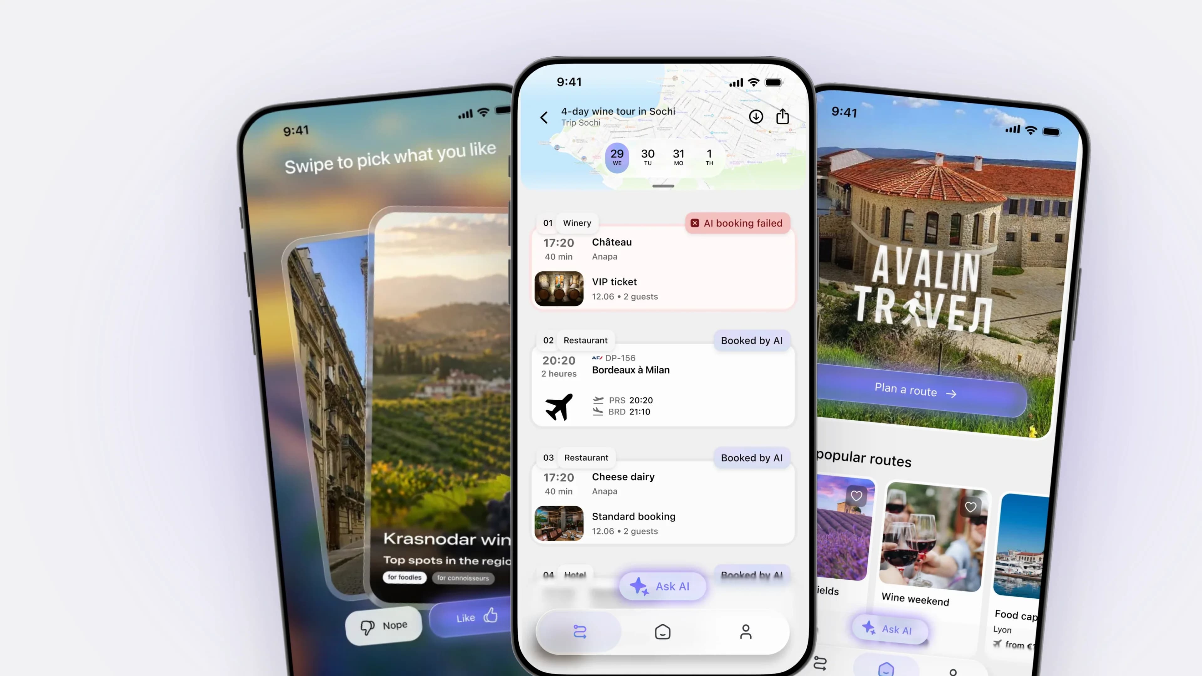
Type: AI travel planner — you describe your trip in words and take a game-like quiz about your tastes, and the AI builds a day-by-day itinerary from a real catalog of wineries, hotels, and farms (web + installable mobile app, PWA). Role: Senior Product Designer (contract) — UX/UI, front-end architecture of the interface, and design reviews of the build. Team: Small product team (product, design, frontend, full-stack backend). Platforms: Web + mobile. Audience: Travelers in Russia and France who care about wine and agritourism; partners — wineries, hotels, farms. Context: MVP for SPIEF (St. Petersburg International Economic Forum) and France's Ministry of Culture and French public tourism bodies — tight deadline, a showcase demo for investors and partners. At a glance Challenge: take a traveler from their tastes to an AI itinerary and a real partner inquiry in one flow. What I did: defined the product flow, designed the quiz, streaming generation, and map, built the liquid-glass design system from scratch, and ran design reviews with code fixes in Nuxt/Vue. Result: the project is in development and under NDA, so no release numbers; the engine became the Avalin Travel module, piloted in RZD Poputchik and adapted for Aeroflot. Problem The request hid three products: taste matching, AI itinerary generation, and a partner inquiry. Planning was scattered across articles, maps, and chats with estates. Generation took 20–60 sec and felt frozen behind a spinner. There was no booking or payment in the Russian market. The backend (6 microservices) was incomplete, the catalog partly seeded, and users mostly plan from a phone on 4G. Key decisions One flow instead of three apps I set a single path: taste quiz and a natural-language request (dates, budget, group size, departure city) → AI generation → day-by-day map → inquiry. All steps share one visual language, so it reads as one product, not three tools. Taste profile as a game, not a form The quiz is a swipe mechanic with haptics and a refinement tree: swiping right opens a deeper sub-stack. It outputs a preference vector that shapes which places enter the route. Separate network and local swipe layers keep the session intact as the profile deepens. The AI wait as a demo moment, built from a real catalog I moved from a spinner and hard timeout to SSE streaming (meta → chunk → itinerary → done) with live progress, so the itinerary types out in front of the user. The result maps to the catalog, then real photos and prices batch-load; duplicates within a day collapse into one marker. "Ask AI" refines the route through dialogue. Map by day, and an inquiry instead of booking The itinerary lives on a full-screen 2GIS map with an iOS bottom sheet and Polaroid markers showing photo, price, and day color. Since booking didn't exist, the trip ends in a one-tap Lead Capture inquiry with live statuses and data minimization under Russia's personal data law (152-FZ): conversion with no payment or login. Liquid-glass system on top of an unfinished backend I built the iOS-26 glass effect in pure CSS with tokens: a ready-made library broke in Safari/Firefox and hurt performance. One glass CTA replaced ~15 mismatched buttons; blur stays ≤22px for 60 fps. Fonts shrank 95% and images 73%. Unfinished surfaces sit behind feature flags, so the demo never shows a broken screen. One engine embedded into carriers' products The engine was packaged as the embeddable Avalin Travel module. In the RZD Poputchik pilot, passengers see the arrival city on the way and plan a route from the station. For Aeroflot, the same structure runs in the app and on the seat-back screen (IFE), re-skinned to the brand, plus a 3D cabin. Outcome The project is in development and under NDA, so these are product effects we track, not numbers: trip-planning time: natural-language request + quiz instead of browsing articles and maps drop-offs while waiting: streaming and live progress instead of a minute-long spinner design reviews in code closed errors that broke the core flow: quiz state desync and duplicate places on the map Launch hypotheses: higher inquiry conversion, engagement, and trust in AI through real photos, prices, and a map.

Travel · AI · PWA
Pilot
with Russian Railways’ Poputchik

Travel AI — an app for agritourism and wine tourism

Type: AI travel planner — you describe your trip in words and take a game-like quiz about your tastes, and the AI builds a day-by-day itinerary from a real catalog of wineries, hotels, and farms (web + installable mobile app, PWA).
Role: Senior Product Designer (contract) — UX/UI, front-end architecture of the interface, and design reviews of the build.
Team: Small product team (product, design, frontend, full-stack backend).
Platforms: Web + mobile.
Audience: Travelers in Russia and France who care about wine and agritourism; partners — wineries, hotels, fa…

B2CB2BAIProduct
Video · web
5 weeksto public beta

ONIX Stream — Video Meetings & Streams With No Install

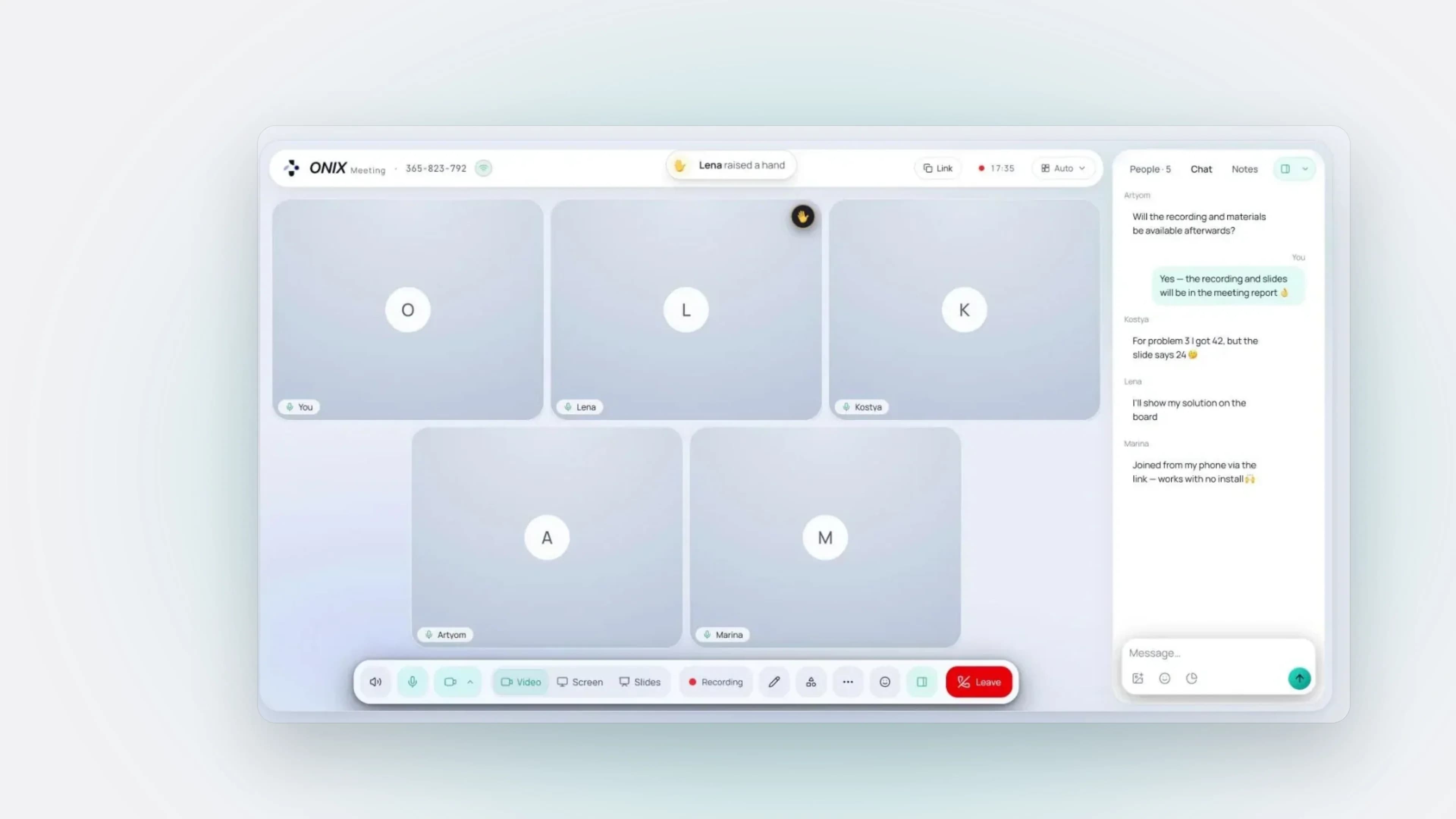
Type: a web service for video meetings and live streams — guests join via a link right in the browser, with no install and no sign-up (web + iOS shell) Role: Senior Product Designer (freelance contract) — product, UI/UX, and design-to-code: from idea and architecture to production code Team: me + AI agents (Claude in Cursor): product, design and engineering single-handedly Timeline: 5 weeks from the first commit to a public beta Platforms: Web (desktop + mobile), iOS via Capacitor Audience: tutors, teachers and small teams — and their guests, who have neither an account nor any wish to install something At a glance Challenge: hosts teaching across countries and networks got video from one tool and stitched the board, polls and materials together from five tabs. What I did: product, UX, design system and production code, solo with AI agents. Outcome: public beta in 5 weeks; no usage metrics yet. Problem It started with a teacher teaching students in another country, over mobile internet and restricted networks. Guests had to install an app or sign up, so lessons began with “it won't open for me.” Calls dropped while the indicator said “excellent,” and slide text was unreadable. The hard part: one interface for a 1:1 lesson and a webinar for a hundred viewers, on phones and weak laptops. Key decisions Guests need only a link and a name Installs and accounts stay with the host. If the browser blocks the camera, the lobby shows a hint instead of an error. Meetings and webinars differ in rights, not UI: one lobby switch sets them, and a webinar guest goes live via “invite to stage,” a grant signed on the server. A lesson and a stream stay one product. Slides instead of screen sharing Screen sharing blurred small text and hid the host behind windows. Instead, the deck (PDF, PPTX, DOCX) is uploaded into the room: it opens in seconds, looks the same for everyone, and the host stays on camera, moving their video over the slide. Split view puts a slide next to the board; presenter mode shows the host upcoming slides while students see only the current one. Everything stays inside the call Miro, Mentimeter and Kahoot send people to another tab, and the host loses the group. Six modules (poll, quiz, word cloud, mood, match the pairs, timer) and a whiteboard launch from one menu over the video. The host admits guests from a waiting room without interrupting the room; when it can't fit everyone, the meeting goes out as an RTMP stream to YouTube, VK Video or Twitch. A connection indicator you can trust The server called a 300 ms ping “excellent,” and the panel showed “68% loss” on a normal call. I capped the rating by real RTT and loss, measured on audio. A post-call report explains what slowed things down and what to change. AV1 screen share halves the bitrate for the same text, and with 20+ people only the speaker stays sharp: the call simplifies instead of crashing. A design system written for AI agents “Dark glass” runs on one token set with two themes, set separately for the app and the room; blur always comes with a solid fill. So agents wouldn't erode it, I wrote the design rules as ten mandatory UI rules in AGENTS.md and reviewed animations, error states and mobile layouts directly in code. 334 of 343 commits were written with Claude. Paid value visible before paying The board and polls are visible but dimmed on Free, one click from an upgrade. Streaming is gated from Business because a server worker runs it. Limits are checked on the server, not just drawn in the UI. Outcome ONIX Stream is in public beta, with no product usage metrics yet. Verified so far: guest entry: a link and a name, no install, no sign-up up to 100 participants per meeting; load estimates put one node at ~120–150 webinar viewers At launch we'll measure late session starts, meeting engagement, connection complaints and conversion to paid plans.

Video · web
5 weeks
to public beta

ONIX Stream — Video Meetings & Streams With No Install

Type: a web service for video meetings and live streams — guests join via a link right in the browser, with no install and no sign-up (web + iOS shell)
Role: Senior Product Designer (freelance contract) — product, UI/UX, and design-to-code: from idea and architecture to production code
Team: me + AI agents (Claude in Cursor): product, design and engineering single-handedly
Timeline: 5 weeks from the first commit to a public beta
Platforms: Web (desktop + mobile), iOS via Capacitor
Audience: tutors, teachers and small teams — and their guests, who have neither…

B2BB2CProductDesignSystemAI
Networking · AI · mobile
Testingsuccess metrics defined upfront

Picaton — a platform for networking, projects, and AI

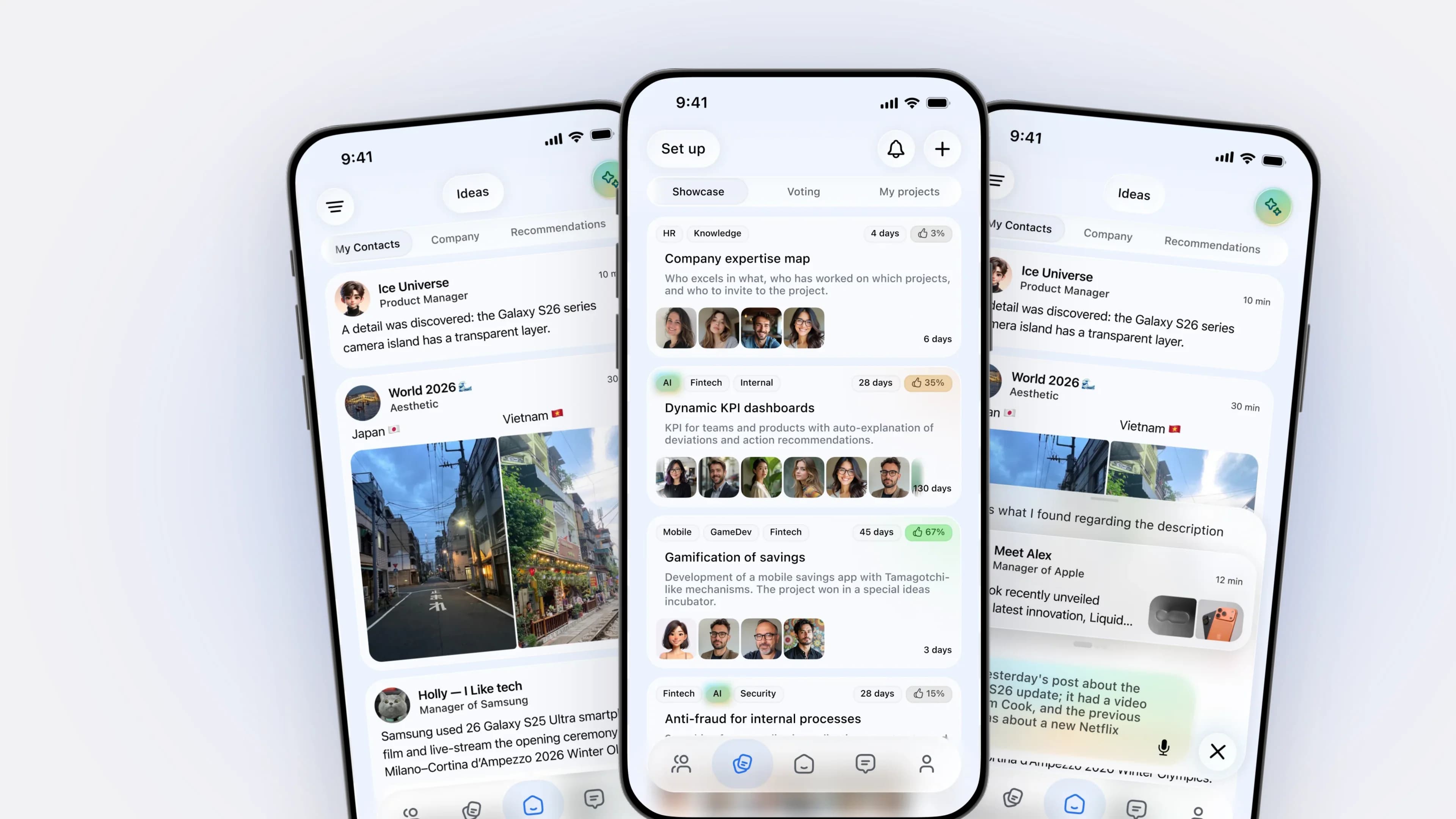
Role: Senior Product Designer (contract), remote Timeline: January 2026 — present Status: the product is in testing, no release metrics yet At a glance Task: people meet at events, swap contacts and lose touch; nothing turns contacts into projects. What I did: product concept, IA and flows, UI and design system, AI scenarios; design review of code in Cursor. Result: in testing, no release metrics yet; success metrics defined upfront. Problem Tools are split by task: Telegram for chat, LinkedIn and HH for careers, business cards offline, projects elsewhere. Profiles are rigid, and AI is usually a feature for its own sake. The product had to merge a messenger, social network, task manager and business card with no reference pattern, without overloading the interface. Key decisions A profile builder instead of a fixed form Rigid profiles limit existing services, so users build theirs from blocks: career, skills, projects, reviews, achievements, custom blocks. The profile becomes self-presentation for the context, not a form. Digital business cards Sharing by QR or link, with profile versions per scenario, adds a person to the network instantly and removes manual contact entry. Contacts that become teams and projects From contacts you build teams, launch projects and see expertise, so the network is a working tool, not an archive. An idea feed instead of a social feed Users publish ideas, others join and vote: a project factory rather than another social network. AI in the background, not a chatbot AI suggests connections, recommends people and rewrites, shortens or fixes text inside the flows: an assistant, not a toy. Card-based navigation Home gives quick access to projects, feed and chat, anchored by a bottom bar. Four products collapsed into one card structure without losing scenarios. Outcome Success metrics were defined upfront, and the flows were designed for them: time to exchange a contact: seconds instead of minutes “meeting → added to the network” conversion, via card scans share of users who created or joined a project share of sessions started from an AI-suggested connection Interactive prototypes were reviewed with stakeholders.

Networking · AI · mobile
Testing
success metrics defined upfront

Picaton — a platform for networking, projects, and AI

Role: Senior Product Designer (contract), remote
Timeline: January 2026 — present
Status: the product is in testing, no release metrics yet

At a glance

  • Task: people meet at events, swap contacts and lose touch; nothing turns contacts into projects.
  • What I did: product concept, IA and flows, UI and design system, AI scenarios; design review of code in Cursor.
  • Result: in testing, no release metrics yet; success metrics defined upfront.

Problem

Tools are split by task: Telegram for chat, LinkedIn and HH for careers, business cards offline, projects elsewhere. P…

B2BB2CProductDesignSystem

EdTech

Learning platforms, onboarding and product growth.1 case · 2026

EdTech · web and app
31task types in the builder

Iskra — Learning Platforms for Students and Teachers

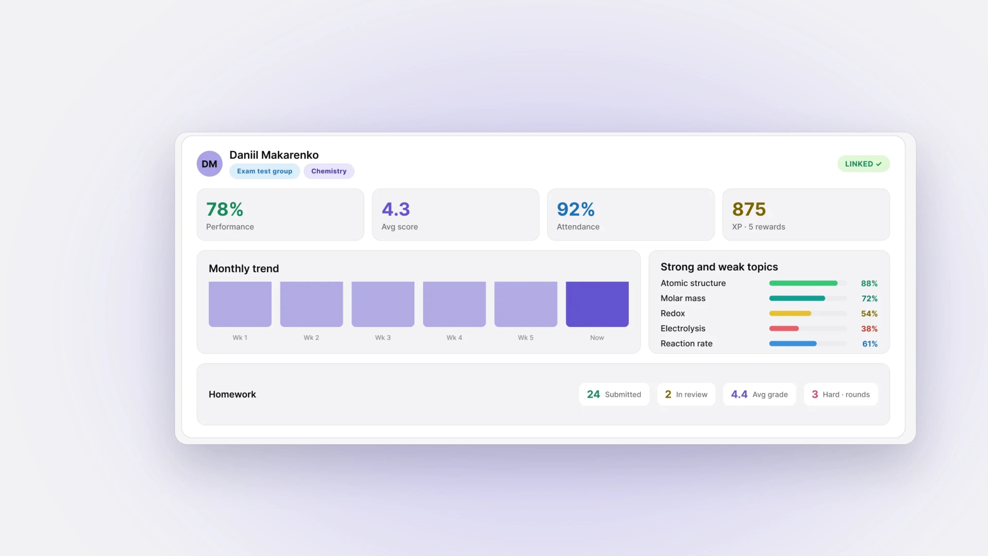
Type: EdTech platform — student dashboard and teacher platform in one (web + installable mobile app) Role: Senior Product Designer (contract) — product, UI/UX, and design reviews of the build Team: ~5 people (product, design, development) Platforms: Web + apps + mobile Audience: tutors and small schools — and their students Status: Closed beta, no release metrics yet. At a glance Challenge: tutors and small schools ran learning across messengers, documents and spreadsheets, because existing LMS platforms were built for universities and corporations. What I did: product concept, IA, builders and task formats, a design system from scratch, plus design reviews and code fixes in Cursor and Claude. Outcome: closed beta; success metrics are built in, no release data yet. Problem Homework got lost in chats, progress was never visible in one place, and teachers spent their time on checking, gradebooks and attendance. The real difficulty: students need to just learn, teachers need to run dozens of students and groups, and both roles pull the interface in opposite directions. Many teachers are not from IT, so every extra button becomes a support request. The market splits into bare task banks, closed gamified courses and teacher workbooks; none covers the whole loop. Key decisions One system for two roles I chose two connected dashboards in one product over two separate products: shared logic, one visual language, one token set with light and dark themes. The team develops one system, not two. The teacher side is organized around Groups / Homework / Gradebook, with a roster sorted by who needs attention. Both home screens are built from the same widget system: schedule, XP and progress, a question of the day. The teacher's builder adds courses, testing and a task bank with Section / Topic / Part / Line filters. Useful before a teacher links in A student can arrive before any data exists, so the home shows a visible progress track instead of a blank screen. Before linking to a teacher, the profile holds one test and empty widgets; after linking, the same layout fills with performance, trends, and strong and weak topics. One engine for 31 task types Tests, tables, sequences and open-ended tasks needed one engine instead of a format per type. The course builder puts every task type in one palette; hovering a type shows how a student will see it, and the task editor keeps statement, scoring and explanation together. Courses and homework are assembled without a developer. Review as a dialogue on the work Complex homework runs in rounds: dated solution and comment exchanges until the work is accepted, with a verdict and score per task. The teacher marks up photos and the board with an annotation layer, so the explanation sits on the work itself. A trainer that grew into a second vertical The same engine took on language courses without a redesign: a reading feed from freely licensed sources with line-by-line voice-over and translation, phrase sets and flashcards. 17 of the 31 task types were added for languages, in the same builder and gradebook. For personal tasks, the system detects the type and context of what the teacher types. Trainer filters show only real branches, never empty options, and level diagnostics use an adaptive assessment to set the starting point. Outcome Iskra is in closed beta, with no release metrics yet. The product is built to measure: teacher time per homework review: target is half the time per group share of lost homework: every submission has a status and a due date; target is zero without a status course assembly speed: a builder with 31 task types instead of tickets to developers share of students who see their progress Verified on prototypes: the gradebook used to block the teacher on any data mismatch; now every state that needs filling in is highlighted instead.

EdTech · web and app
31
task types in the builder

Iskra — Learning Platforms for Students and Teachers

Type: EdTech platform — student dashboard and teacher platform in one (web + installable mobile app)
Role: Senior Product Designer (contract) — product, UI/UX, and design reviews of the build
Team: ~5 people (product, design, development)
Platforms: Web + apps + mobile
Audience: tutors and small schools — and their students
Status: Closed beta, no release metrics yet.

At a glance

  • Challenge: tutors and small schools ran learning across messengers, documents and spreadsheets, because existing LMS platforms were built for universities and corporations.
  • What I d…
B2BB2CEdTechProduct

Brand & Identity

Visual systems for public institutions and studios.1 case · 2024

Architecture · brand and website
1.4% → 2.1%website conversion to inquiries

Dalee Architecture Bureau — brand and a website that sells

Role: Lead UX/UI Designer Team: 4 specialists — UX/UI, Webflow, visual communications, contractors Timeline: November 2023 — September 2024 Status: Brand and website launched in 2024; metrics from the first year. At a glance Challenge: build an architecture bureau’s brand and website from scratch so they help sell projects. What I did: positioning, identity and brand book, website design, an interactive tender portfolio. Result: website conversion to inquiries 1.4% → 2.1%; tender materials from 5 days to 2; design approvals from 12 to 8 working days. Problem Dalee had a strong philosophy and a clear architectural language, but no coherent brand. Visuals didn’t reflect its approach, and the website was a pile of projects, not a sales tool. The brand had to stand out among studios and work both digitally and offline. Key decisions Meaning before visuals I researched the market and competitors, studied how the bureau makes decisions, and shaped the positioning and brand manifesto. Takeaway: the brand had to be architectural in its logic, not decorative. Identity as a system, not a logo Logo, typography, rules for composition and space, brand book, and guidelines. The minimal visual language mirrors the bureau’s architecture. A website that tells how the bureau thinks, not a portfolio I made the prototypes and final design for image-heavy content: large images, white space, micro-animations. After a usability review of the old site, I reworked the path from project to inquiry: fewer steps, clearer calls to action, contact on every page. An interactive portfolio for tenders A project selection for a tender is assembled from ready-made blocks instead of laid out from scratch. The brand beyond the screen Merch and templates for presentations, envelopes, and architectural documentation. Outcome Corporate website conversion to inquiries: from 1.4% to 2.1% , with inquiries collected on the site and in a CRM instead of Excel and Google Forms Tender and presentation material prep: from 5 days to 2 , with the website and an interactive portfolio replacing dozens of PDFs Design approval cycle: from 12 to 8 working days , after introducing regular design reviews and unified presentation standards 5+ major digital projects delivered with developers and construction companies within the year

Architecture · brand and website
1.4% → 2.1%
website conversion to inquiries

Dalee Architecture Bureau — brand and a website that sells

Role: Lead UX/UI Designer
Team: 4 specialists — UX/UI, Webflow, visual communications, contractors
Timeline: November 2023 — September 2024
Status: Brand and website launched in 2024; metrics from the first year.

At a glance

  • Challenge: build an architecture bureau’s brand and website from scratch so they help sell projects.
  • What I did: positioning, identity and brand book, website design, an interactive tender portfolio.
  • Result: website conversion to inquiries 1.4% → 2.1%; tender materials from 5 days to 2; design approvals from 12 to 8 working days.

Problem

…

BrandingWebB2B
LO — social platform and messengerAYAX — transforming design across product and teamAvalin — Interactive 3D Products for Real Estate and GovernmentsAffix Group Corporate PortalTravel AI — an app for agritourism and wine tourismONIX Stream — Video Meetings & Streams With No InstallPicaton — a platform for networking, projects, and AIIskra — Learning Platforms for Students and TeachersDalee Architecture Bureau — brand and a website that sells

Telegram channel

Design here isn’t lectures in your face — it’s a sharp, fact-based breakdown.

@dany_prodesign

@dany_prodesign

13:56

Post image 1

Why did Claude choose this pause icon? It used to be softer, bigger, and easier to notice, but now it's tiny and barely visible …

19
@dany_prodesign

@dany_prodesign

07:01

Post image 1
Post image 2

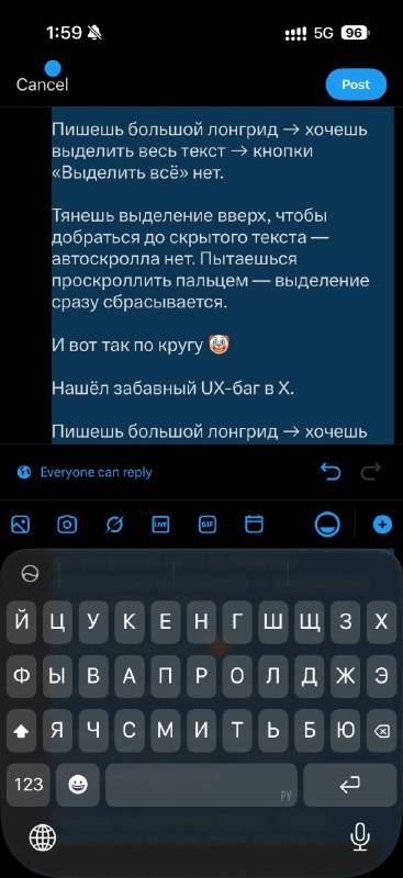
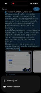
Sometimes this kind of magic happens with text selection in X. You write a longread → want to select all the text → there's no “Select All” button. You drag the selection handle up — hidden text doesn't scroll. You try to scroll — the selection gets cleared. And sometimes scrolling works, but after you let go, it throws you back to the beginning of the post, with the selection handle sitting on top of the bottom bar with “Cancel”. A tiny UX bug that turns text selection into a quest 🤡

252
@dany_prodesign

@dany_prodesign

14:07

Post image 1

Telegram still hasn't learned how to share articles to Stories. Regular post — no problem. But this fancy new format, where you can expand a post and keep writing inside it: text, Markdown, photos, descriptions, etc. — still can't be sent to Stories for some reason. The video shows it perfectly: regular post → can share to Stories. Article → 🤷‍♂️ Seems like Telegram needs to decide what format it actually wants us to use.

393
@dany_prodesign

@dany_prodesign

09:10

Post image 1

A classic Telegram bug. You delete a chat somewhere near the bottom, and it throws you all the way to the top, without preserving your position for some reason …

37
@dany_prodesign

@dany_prodesign

14:46

Post image 1

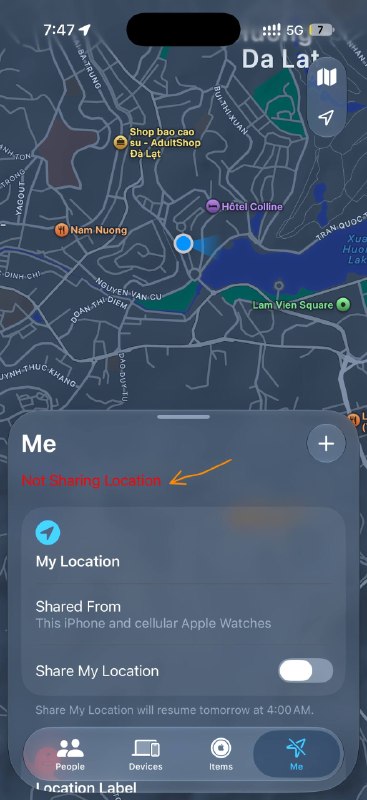
Thanks, Apple, for the great readability. I'd rather squeeze a pill in there, or make the color lighter.

672
@dany_prodesign

@dany_prodesign

08:55

Post image 1

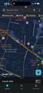
Another Google Maps joke. I'm getting more and more disappointed in the world … companies are so demanding, so strict, so many test assignments, and what do we get in the end? You tap on a review you're interested in, and some nonsense opens up — not your review, not even in the right range … idk.

572
@dany_prodesign

@dany_prodesign

10:50

Post image 1
Post image 2
Post image 3

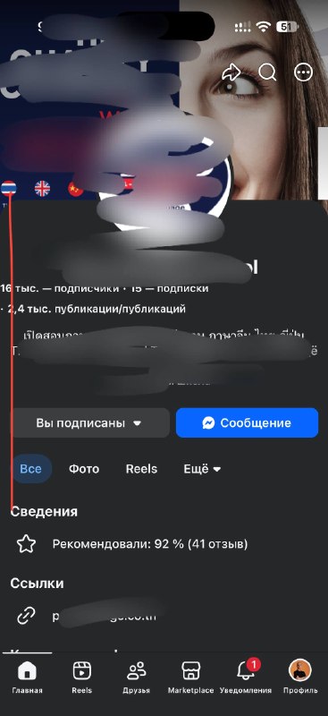
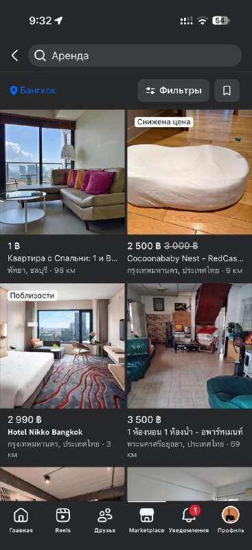
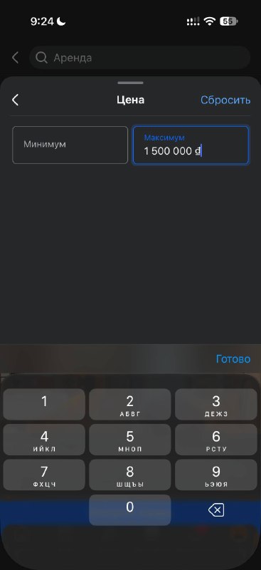
What's going on with Facebook? They have the follower and post counts misaligned. Their marketplace has a limit on the number of digits in currency amounts. So I'm looking for an apartment up to 60 000 ₽, which is 18 000 000 dong, but the folks at Meta won't let me enter more than 1 500 000 (in terms of number of digits) 🫣🤣 And another thing. You choose Bangkok as the location, and it shows you places 80–100 km away … there's no sort-by-distance option … and even when it says 1 km, it's actually somewhere far from where you need to be.

542
@dany_prodesign

@dany_prodesign

02:56

Post image 1
Post image 2

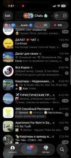
A new messenger from WB, and already crooked corner radii

602
@dany_prodesign

@dany_prodesign

13:06

Post image 1

New messenger from WB, and already with diagonal rounded corners

58

Click to browse posts

CV

Senior Product Designer | UX/UI Designer

Open to relocation · Visa sponsorship for on-site roles · Remote / Hybrid / On-site · UTC+7 · Available in 2 weeks

Open CVPDFWord

7

employers

Bangkok, Thailand

Location

Russian — Native · English — B2 — working proficiency, daily work with distributed teams

Languages

Open to product design collaborations

Available for product design, interface systems, UX strategy, and case-driven redesign initiatives.

Email me
TelegramFacebook

Case studies

  • LO — social platform and messenger — LO — социальная платформа и мессенджер
  • AYAX — transforming design across product and team — АЯКС — трансформация дизайна, бренда и команды
  • Avalin — Interactive 3D Products for Real Estate and Governments — Avalin — интерактивные 3D-продукты для недвижимости и государств
  • Affix Group Corporate Portal — Корпоративный портал Affix Group
  • Travel AI — an app for agritourism and wine tourism — Travel AI — приложение для агро- и винного туризма
  • ONIX Stream — Video Meetings & Streams With No Install — ONIX Stream — видеовстречи и эфиры без установки
  • Picaton — a platform for networking, projects, and AI — Picaton — платформа для нетворкинга, проектов и AI
  • Iskra — Learning Platforms for Students and Teachers — Искра — учебные платформы для ученика и учителя
  • Dalee Architecture Bureau — brand and a website that sells — АБ «Далее» — бренд и сайт как инструмент продаж

© 2026 Daniil Makarenko. Crafted with intention.

CV·Telegram·Email